U.S. Medical Affairs
U.S. Medical Affairs (USMA), an internal organization within AstraZeneca’s Oncology Business Unit, bridges AstraZeneca's oncology teams with scientific advancements to enhance patient care. Its mission is to improve cancer outcomes by providing crucial evidence, insights, and expertise to healthcare providers, addressing data and knowledge gaps within the oncology field.
The client was seeking a logo that encapsulated the purpose, vision, and ambition of USMA, establishing a unique branding, while still falling under the AstraZeneca brand umbrella.
U.S. Medical Affairs
AstraZeneca Internal Organization
Role
Sole Brand Designer
Logo Foundation
USMA is made up of 6 primary departments. It was important to the client that all 6 facets of the organization were involved in the logo.

The iconography represents an interconnected shape with 6 different sectors, working together to create one unit. Imagery is reminiscent of a 'web' or 'cell'.
Color Palette
6 colors, one for each of the primary USMA departments. All colors are within AstraZeneca's brand guidelines.

Wordmark
Using an AstraZeneca-approved font.

Putting it all together
Bridging the gap between symbol and text through the "i" letter.

Variations
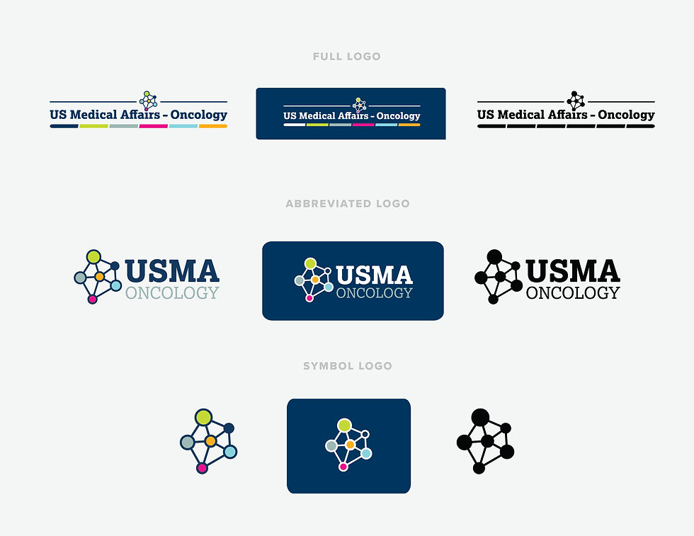
Per the client's request, knockout and black versions were included.
Brand Icons
Iconography associated with each of the 6 departments.